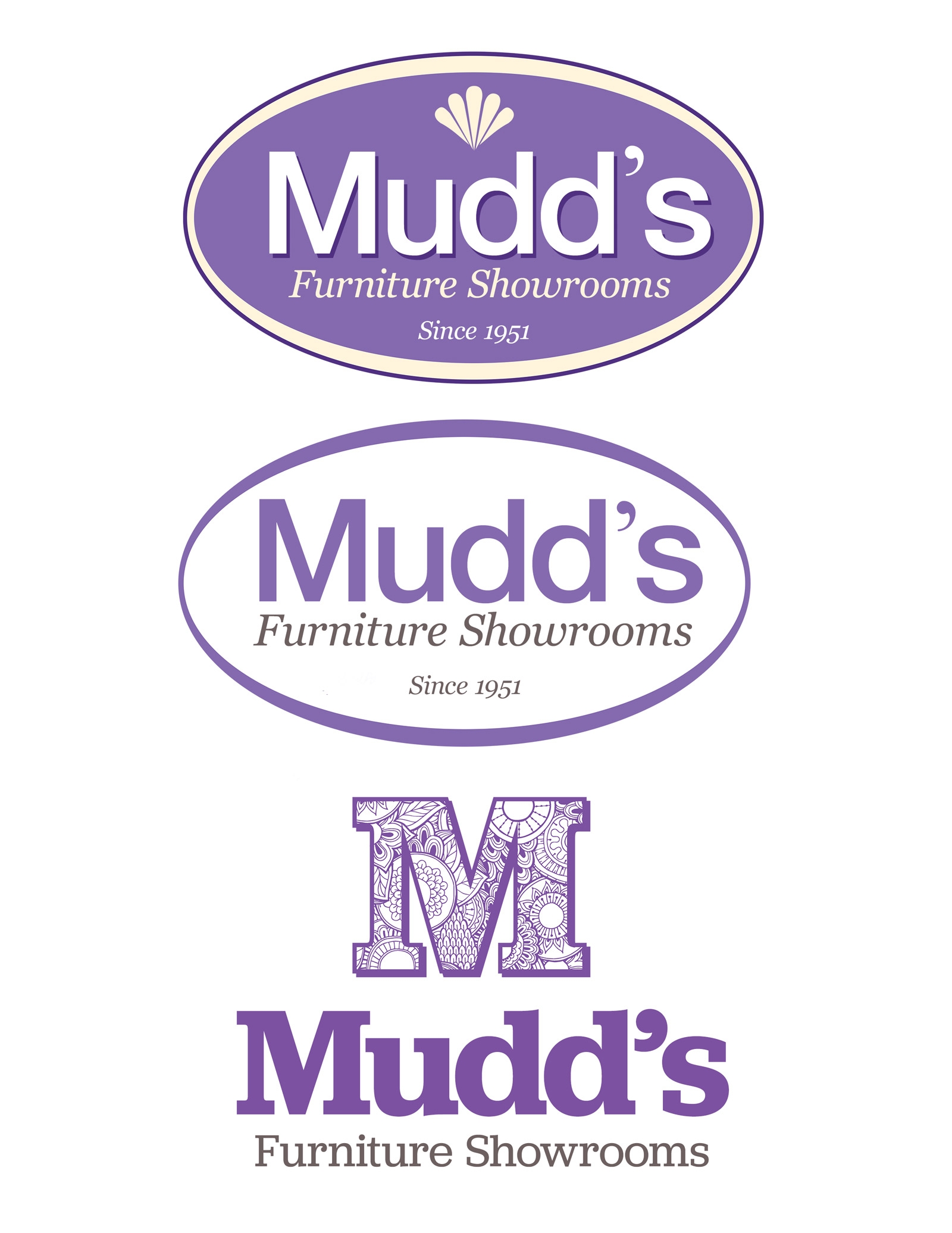
The first five concepts are simple modernization of current logo. I kinda like keeping the oval as it provides some familiarity or continuity so audience isn’t totally lost.


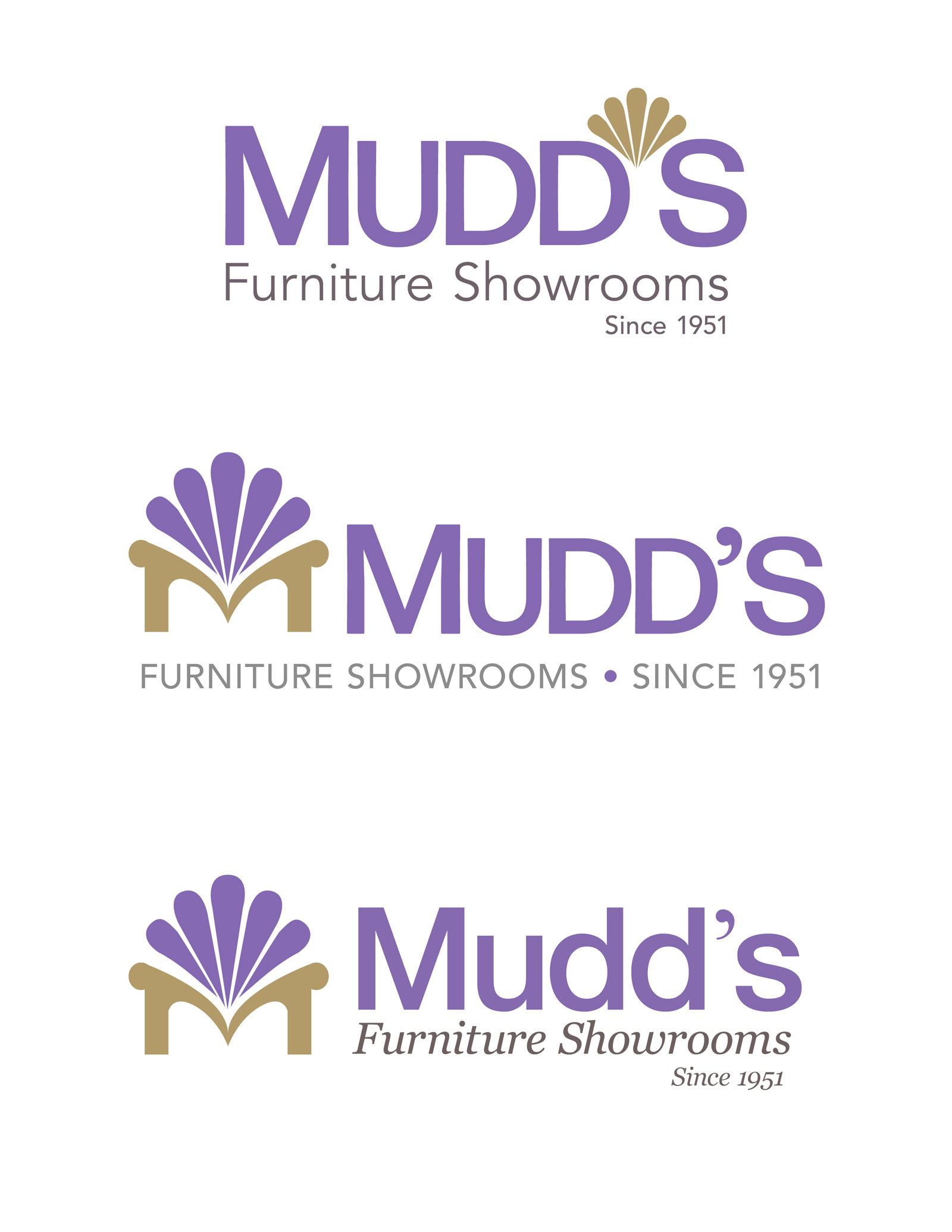
With these, I’m introducing graphic elements. The second is a stylization of a chair with the base being an “M.”
The second concept here uses negative space of the overlapping hearts to form at letter “m”.
